NRL 2025: what you need to know
46 days ago | LeagueUnlimited Media
As the off-season rolls on, 2018 NRL club jerseys are slowly being revealed.
We'll keep track of each club's design updates right here!
Some images courtesy of Savvy Supporter (as watermarked)
No changes to their home jersey, just a new logo to celebrate 30 years since their top-flight debut.

Same story - no changes, just a 30 year logo in place of the normal 'chess piece' logo.

Attempted replica of their original 1988 with some subtle variances/

No changes apart ISC experimenting with the collar.

Same story - no changes, just that collar.

A new collar, slightly smaller sponsor mark for KIA and a white triangle added to create a double blue vee.

The black away strip is gone replaced with a heritage style jersey with horizontal blue and white bars.

An inverted version of the home jersey - mostly blue with two white vees

The Bulldogs' annual experimental jersey is black and blue with an intricate design

A slight modification to the classic hoops design with them bent into chevrons

An inverse of the clubs' heritage jersey with a blue vee on black base.

Another new design with a stylised navy vee made of crossed swords (we think?) plus new front of jersey partner TFH Hire who've upgraded their deal with the club, replacing outgoing partner Aquis.

No changes to their 2017 strip.

No changes here either.

A brand new design for their 20 Years celebration. Classic design, somewhat of a throwback to their original 1998 design. New logo too!
An interesting design on white with some subtle lightning bolts.

No changes to this classic, although ISC's new collar features

No changes apart from that ISC collar

Another new design, moving back to the large-scale logo across the top of the jersey on a navy base.

Same as home but with a white base.

Similar to the home jersey but with pink highlights around the top of the jersey.

A new blue design with yellow bands. Parramatta have moved to ISC Sport (from xBlades), and Aland have upgraded to major sponsor.

Inverted design of the home jersey with blue stripes on a yellow base.

The design stays the same although Penrith have switched from Asics to Classic as their manufacturer. They also have a new chest plate sponsor.

Similarly no changes here apart from the new manufacturer and chest plate sponsor.

The Dragons have switched to XBlades as manufacturer and with it comes a new look for the Red V - or in fact an old one. The sponsor moves up to interrupt the famous vee.

A new look for the alternate jersey with white chevrons repeating on a red base.

With Crown's major sponsorship withdrawal, Fujitsu switch to the home jumper. The 110 year logo does not feature on an otherwise unchanged strip.

No sponsor found as yet, but the jersey itself remains the same.

A nod to a jersey of many years gone by sporting a red base with a green vee.

Yeah, this ain't changing any time soon. Although the inside neck tag is nice - 1908 | ESDRLFC.

No changes here either.

No noticeable changes from 2017
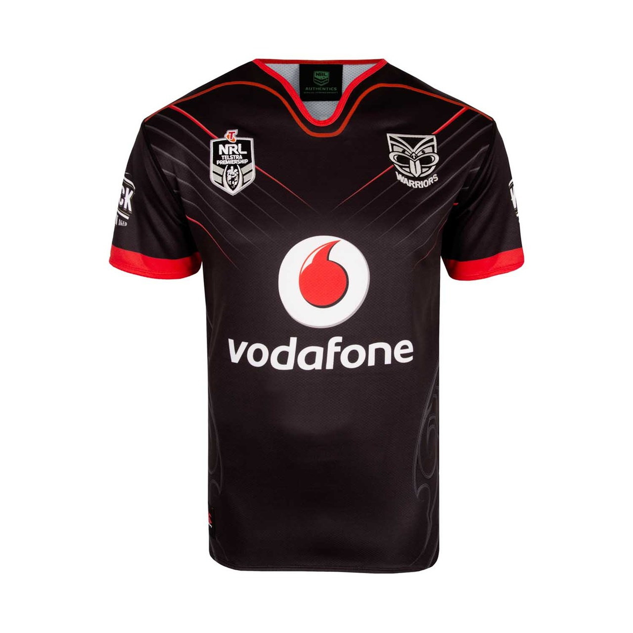
Similarly no changes.
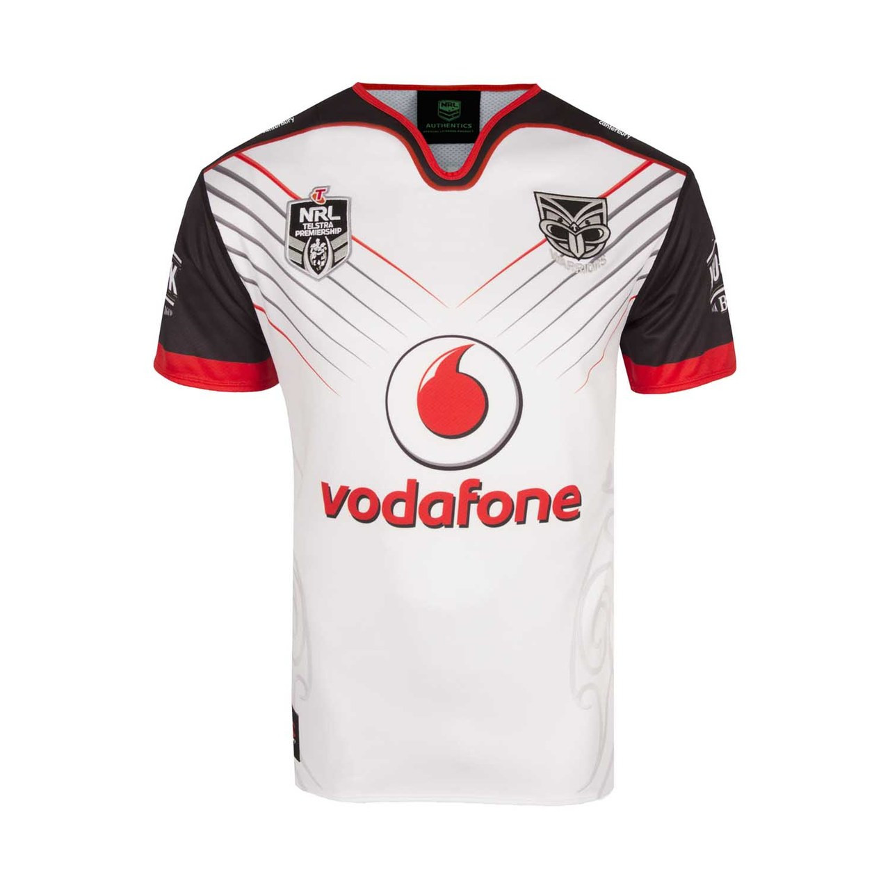
The Heritage Jersey resonates back with the club historical colours and the chevron shapes provide a strong link back to the NRL.
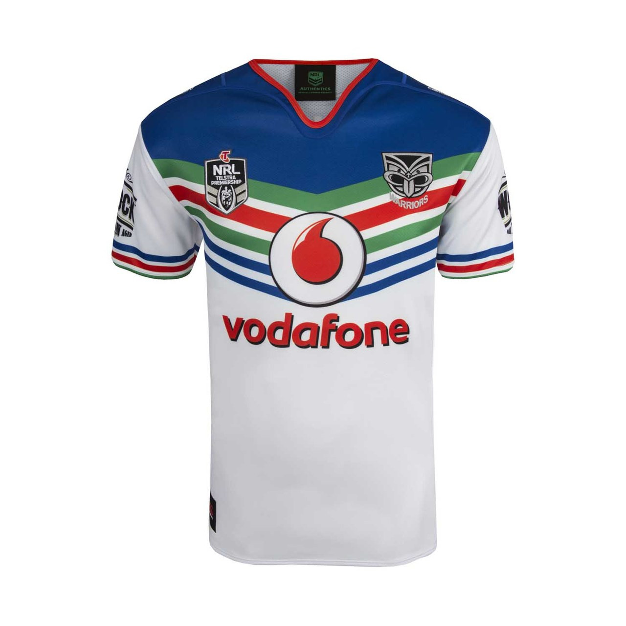
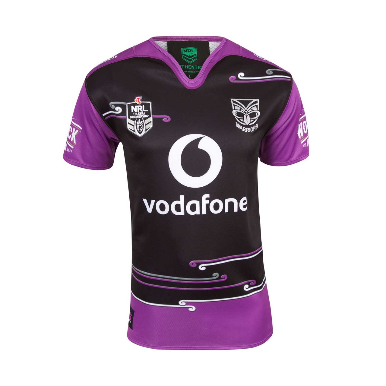
The warrior is looking to the left about to engage in battle… The weapons are befitting of a top warrior. The patu is a strong attacking and defensive weapon and the tewhatewha is a very chiefly weapon. The ferns represent NZ, the mist is spirit, wairua, and pays homage to our homeland Aotearoa. Mist is also a connector to our ancestors and to the earth mother and sky father.
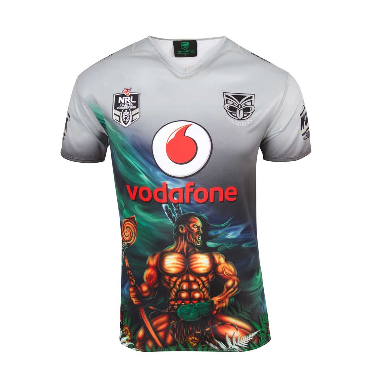
The koru is symbolic of life, growth, new beginnings, awakening, nurturing, new phase (in life), the spirit of rejuvenation, reaching upward toward the light and positivity. With this jersey we pay respect to all of the women in our lives - Our Grand mothers, mothers, wives, partners, daughters and friends.
No changes from 2017

No changes from 2017

A classy black design with gold and white lines

XXXX have scaled back their sponsorship and Suncorp are no longer a jersey sponsor, which brings QLD Cup sponsor Intrust Super to the front of jersey. The design is simple with subtle thin chevrons down the chest, and the gold piping that adorned the jersey several years ago is back, with thick armbands and a line around the back of the collar. The shorts (not pictured) also have a gold hem.

New look, new sponsor. Chevrons are in as the Blues now welcome Canterbury NZ as their apparel partner, Bryden's replaces VB on the front of the kit, and yes - Toohey's New is back.
